| |
CONTENT
- Basics.
- Object attributes.
- Skins painting.
- Smart tiling.
- Animation.
- Appenix. Some standard widget skin settings.
Basics.
Skin is the basic graphics object in Aston2. It contains a set of resources (images, sounds, etc.) and the layout file ("layout.xml"). The skin content is stored in a folder, which can be zip-archived.
"Layout.xml" is a standard XML file which contains the description of the program's graphic objects position and the way of their displaying.
Each object can have its own additional settings.
"Layout.xml" includes the standard XML header and 'skin_layout' root section, that contains objects:
<?xml version="1.0" encoding="utf-8"?>
<skin_layout>
  <object name="Panel"/>
  <object name="Start Button"/>
</skin_layout>
|
Each object can have widget-dependent settings and several skins. For example:
...
<object name="Mega Clock" clock_format="2H:2m:2s">
  <skin name="background"/>
  <skin name="logo1"/>
  <skin name="button1"/>
  <skin name="foreground"/>
</object>
...
|
'Skin' section contains the name and the description of skin painting method and animation.
Object settings.
Each skinned object can have some additional settings (depending on the widget functionality).
Let's consider a typical case - the positions of widget elements can be defined by the skin settings.
Generally, the elements position is a combination of two rectangles -
percent offset rectangle and pixel offset rectangle.
For example:
...
<object name="Menu"
        normal_font="Arial, size=16, style=B"
        highlight_font="Arial, size=16, style=B" >

  <background name="default">
    <percent_rect x="0" y="0" x2="100" y2="100"/>
    <pixel_rect   x="0" y="0" x2="0"   y2="0"/>
  </background>

  <left_scroller>
    <percent_rect x="0" y="0" x2="0"  y2="100"/>
    <pixel_rect   x="0" y="0" x2="20" y2="0"/>
  </left_scroller>

  <right_scroller>
    <percent_rect x="100" y="0" x2="0" y2="100"/>
    <pixel_rect   x="-20" y="0" x2="0" y2="0"/>
  </right_scroller>

</object>
...
|
As you see, "menu" object has additional font settings, positions of the background and two scrollers.
The backgroud coincides with the whole area of "menu" object (100% for right and bottom coordinates, plus zero pixel offset).
The left scroller position is defined relatively to the left side of "menu" object (0% for both percent X-coordinates, plus the pixel offset for the right edge).
The right scroller position is defined relatively to the right side of "menu" object (100% for both percent X-coordinates, plus the negative pixel offset for the left edge).
If some coordinate is equal to zero, you can skip it.
If the percent rectangle coincides with the whole widget area, you can skip 'percent_rect' section.
If the pixel rectangle is zero, you can skip 'pixel_rect' section.
Skin creation.
Every object can contain several skins for different elements.
For example:
...
<object name="Menu">

  <skin name="background">
    <paint image="a.jpg"/>
  </skin>

  <skin name="scroll left">
    <paint image="b.jpg"/>
  </skin>

  <skin name="scroll right">
    <paint image="c.jpg"/>
  </skin>

</object>
...
|
'Paint' section defines the way this rectangle is drawn, and can have percent and pixel components.
You can paint with a solid color:
...
  <skin name="background">
    <paint color="0xFF000000" />
  </skin>
...
|
'Color' attribute defines the transparency and the color of the element.
It's HTML-like way to set color, but first two hexadecimal digits define the transparency.
Thus, in our example, "background" element is black and opaque.
Also, you can use an image file to paint the element:
...
  <skin name="background">
    <paint image="test.jpg"/>
  </skin>
...
|
If both 'image' and 'color' attributes are present, 'image' attribute has a higher priority.
In case the image size doesn't match the paint area size, there are three ways to handle this situation in Aston2:
Tiling
Stretching
Smart tiling
You can switch tile/stretch modes for X-axes and Y-axes independently by means of 'align_u' and 'align_v' attributes:
...
  <skin>
    <paint image="background.jpg"
           align_u="tile"
           align_v="stretch"/>
  </skin>
...
|
If the align attribute is skipped, tiling will be used by default.
If you use tiling, please note that one of the tiles can be partially displayed.
You can assign this part to the edges by 'justify_u' and 'justify_v' attributes both for X-axes and Y-axes.
For example:
justify_u="0" : tiles are docked to the left edge
justify_u="50" : tiles are docked to the center
justify_u="100" : tiles docked to the right edge
 If you need to use only some part of an image, use "u", "v", "u2", "v2" attributes to define the source texture rect.
For example:
...
  <skin>
    <paint image="background.jpg"
           u="0"
           v="0"
           u2="32"
           v2="32"/>
  </skin>
...
|

You can use an animated image with the help of 'animation' attrbute:
...
  <skin>
    <paint animation="anim1"/>
  </skin>
...
|
'Animation' attribute has a higher priority than 'image'.
You can read more about animation here.
PNG-images can use alpha channel.
Thus, you can use several paint elements to multi-pass painting with different images, alignments and other settings of the paint elements.
Every skin can contain several 'paint' sections.
This is the way to use multi-pass painting technique.
For example:
...
  <skin name="background">
    <paint image="rocks.jpg"/>
    <paint color="0x88DDDDDD">
      <percent_rect x2="100" y2="100"/>
      <pixel_rect x="8" y="8" x2="-8" y2="-8"/>
    </paint>
  </skin>
...
|
Smart tiling.
Smart tiling can be used when the destination paint area and
the source image sizes don't match (one is bigger or smaller than the other).
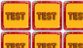
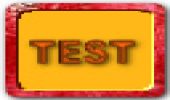
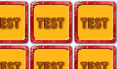
For example, a source image:
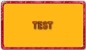
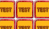
 If you use smart tiling, you can get a result like this:
Smart tiling allows to paint ojects with borders and to place an integer number of decorative elements.
In case there is not enough space for the decorative element, it can be hidden (optionally).
The basic principle of smart tiling is markup of the source image to horizontal and vertical cells.
You can do it recursively.
For example, firstly, you can split an image vertically:
 Than, each cell is splited horizontally:
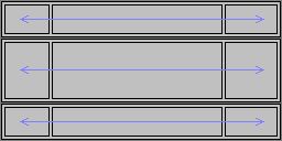
Finaly, each cell should be set up:
- corners should be of a fixed size,
- left/right sides should be tiled vertically only,
- top/bottom sides should be tiled horizontally only.
It's a general idea. Now, let's consider cell's option attributes in more details:
| order | - the priority of the cells order. If this attribute is skipped, the cell will be displayed after all the other neighboring cells. |
| w | - the cell width in the source image (in texels). If the cell align is horizontal, this attribute should be skipped. |
| h | - the cell height in the source image (in texels). If the cell align is vertical, this attribute should be skipped |
| size | - the preliminary cell size according to the align direction (in percent of the destination area size, 100% by default). |
| min | - adjusts the cell destination area size minimum (in pixels). |
| max | - adjusts the cell destination are size maximum (in pixels). |
| step | - adjusts the cell desination area size by a certain step (in pixels). |
| pos | - the cell position (in percent of distanation area size). For example, the central position is 50%. |
| mode_u | - the source image displaying mode endwise X-axis. The allowable values are 'tile' (by default) or 'stretch'. |
| mode_v | - the source image displaying mode endwise Y-axis. |
| justify_u | - justification endwise X-axis (in percent). |
| justify_v | - justification endwise Y-axis (in percent). |
Attributes 'w' and 'h' are related to the source image area, all the other are related to the destination paint area space.
Let's consider some skin example:
...
    <skin name="background">
        <paint image="test.jpg">
            <cell h="8"/>
            <cell h="16 order="1"
                        step="16"
                        max="64"
                        pos="50%"/>
            <cell h="8" pos="100"/>
        </paint>
    </skin>
...
|
Here are 3 vertically aligned cells. The first cell has order="1".
It should be placed vertically to center (see attribute 'pos').
Preliminary, it tries to take 100% of space (by default size="100%"),
but there are some restrictions (have a look at the 'step' and 'max' attributes).
The rest of the space from top and bottom is taken by the above and the bottom cells.
Please note, that the last cell should have pos="100". Keep to this rule in future to avoid unxpected results.
Here is a more complex example with 3x3 cells:
...
    <skin name="background">
        <paint image="test.jpg">
            <cell h="4" order="1" max="4" size="50">
                <cell w="24" order="1" max="16" size="50"/>
                <cell w="96"/>
                <cell w="8" order="2" max="8" size="50" pos="100" justify_u="100"/>
            </cell>
            <cell h="24">
                <cell w="24" order="1" max="16" size="50"/>
                <cell w="96"/>
                <cell w="8" order="2" max="8" size="50" pos="100" justify_u="100"/>
            </cell>
            <cell h="4" order="2" max="4" pos="100" size="50" justify_v="100">
                <cell w="24" order="1" max="16" size="50"/>
                <cell w="96"/>
                <cell w="8" order="2" max="8" size="50" pos="100" justify_u="100"/>
            </cell>
        </paint>
    </skin>
...
|
As you can see, this exaple used a source image 128x32 texels (sum up 'h' and 'w' attributes of each cell).
Firstly, the image splited vertically to 3 cells. Than each of them is splited horizontally to 3 sub-cells.
Let's consider some typical tricks in this exaple:
- You can't set the distanation area fixed pixel size for a cell directly.
Use 'max' attibute, where size="100%" (it is the default value therefore it can be skipped).
For example, if you need 16-pixels size of the destination area, set max="16".
- Let's consider a case, when cells for the opposite sides use 'max' attribute to set their pixel sizes,
but the destination area is smaller than both cells' max size.
In this case a cell size doesn't depend on 'max' attribute.
Use size="50%" and the resulting size of both cells will be aproximately equal.
'Justify_u' and 'justify_v' attributes let one get better results.
Animation.
Before using animation in skins, you should describe it in 'animation' section.
In your skin you can use as many animated elements as you want, and choose any names for them.
Please refer to the example below:
...
  <skin>
    <animation name="anim1">
        <render image="frame0.jpg"/>
        <render image="frame1.jpg"/>
        <render image="frame2.jpg"/>
        <sequence name="on_Start">
          <frame render="0"/>
          <frame render="1"/>
          <frame render="2"/>
          <frame render="1"/>
          <frame render="0"/>
        </sequence>
    </animation>
    <paint animation="anim1"/>
  </skin>
...
|
The first step is defining the render states (please refer to 'render' sections).
In the example above, the animation contains 3 render states, that use 3 images - "frame0.jpg", "frame1.jpg" and "frame2.jpg".
Render states are automaticaly enumerated, starting from the zero index.
If the animation frames are assembled into one picture, you should use "u" and "v" attributes to set the offset point in the texture:
...
  <skin>
    <animation name="anim1">
        <render image="button.jpg" u="0" v="0"/>
        <render image="button.jpg" u="0" v="64"/>
        <render image="button.jpg" u="0" v="128"/>
        <sequence name="on_Start">
          <frame render="0"/>
          <frame render="1"/>
          <frame render="2"/>
          <frame render="1"/>
          <frame render="0"/>
        </sequence>
    </animation>
    <paint animation="anim1"/>
  </skin>
...
|
The next step is defining the frames sequences (see 'sequence' and 'frame' sections).
Each frame corresponds to a certain render state by its index.
Sequences names are depended from the widget implementation.
Be careful - if you make a mistake in the name, a widget can never start your sequence.
In the example above, there is only one sequence - "on_Start". It includes 5 frames.
As a result, you'll see the following sequence of render states: 0, 1, 2 ,1 ,0.
The animation speed is controlled by "fps" attribute (frames per second) for each frame.
If you skip this attribute, fps will be equal to "30" by default:
...
    <sequence name="on_Start">
      <frame render="0" fps="15"/>
      <frame render="1" fps="20"/>
      <frame render="2" fps="25"/>
      <frame render="1"/>
      <frame render="0"/>
    </sequence>
...
|
Some widgets use animation to show their percent indicators
(for example some process progress - loading, infill level, etc.).
In this case, instead of 'sequence' section, 'indicator' section is used:
...
    <animation name="indicator1">
        <render image="img1.jpg"/>
        <render image="img2.jpg"/>
        <render image="img3.jpg"/>
        <render image="img4.jpg"/>
        <indicator name="progress"/>
    </animation>
...
|
The indicator uses all the available render frames.
Appenix. Some standard widget skin settings.
1. Section
...
    <object name="Section">

        <mode name="horizontal"
              background="background"
              foreground=""
              gripper="horizontal gripper">
            <item_pixel_rect      x="0"  y="0" x2="0" y2="0"/>
            <gripper_percent_rect x="0"  y="0" x2="0" y2="0"/>
            <gripper_pixel_rect   x="0"  y="0" x2="0" y2="0"/>
        </mode>
        <mode name="vertical"/>
        <mode name="no gripper"/>

        <skin name="background"/>
        <skin name="foreground"/>
        <skin name="horizontal gripper"/>
        <skin name="vertical gripper"/>
    </object>
...
|
Sections support three modes: horizontal, vertical and gripperless.
In the example above only "horizontal" mode is completely defined, other modes should be defined the same way.
Each mode has the following attributes:
| background | - the name for the background skin |
| foreground | - the name for the foreground skin |
| gripper | - the name for the gripper skin |
The skins list depends on the used names.
Also, each mode defines some rectangles for the items sections and the grippers.
Percent component of the section item ('item_percent_rect') isn't used, since it is hard coded for the whole section area.
2. Panel
...
    <object name="Panel">
        <mode name="left" background="vertical">
            <section_container>
                <pixel_rect   y="16" y2="-2"/>
            </section_container>
            <thickness_resizer>
                <percent_rect x="100" x2="100" y2="100"/>
                <pixel_rect   x="-2"/>
            </thickness_resizer>
            <lenght_resizer>
                <percent_rect y="100" y2="100" x2="100"/>
                <pixel_rect   y="-2"/>
            </lenght_resizer>
        </mode>
        <mode name="right"/>
        <mode name="top"/>
        <mode name="bottom"/>
        <mode name="popup"/>

        <skin name="horizontal"/>
        <skin name="vertical"/>
    </object>
...
|
Panels support five modes: left screen edge aligned, right aligned, top aligned, bottom aligned, popup mode.
In the example above only "left" mode is completely defined, other modes should be defined the same way.
Each mode has the following attributes:
| background | - the name for the background skin |
| foreground | - the name for the foreground skin |
Skins list depends on the used names.
Also, each mode defines some rectangles for section container, thickness resizer and lenght resizer.
In the popup mode the resizers aren't used.
Percent component for section container is not used, because it is hard coded for the whole panel area.
3. Start Button
...
    <object name="Start Button" width="128" height="128">
        <skin name="horizontal"/>
        <skin name="vertical"/>
    </object>
...
|
Object attributes:
| width | - the width of the button |
| height | - the height of the button |
The reserved skin names are "horizontal" and "vertical" (for the horizontal/vertical mode).
This widget supports animation with teh following names:
| "anim_Spawn" | - animation on the first object appearing |
| "anim_Highlight_On" | - on mouse hover |
| "anim_Highlight_Off" | - on mouse leave |
| "anim_Press_On" | - on mouse button pressing |
| "anim_Press_Off" | - on mouse button releasing |
4. Menu
...
    <object name="Menu"
            normal_font="Arial, size=16, style=B"
            highlight_font="Arial, size=16, style=B"
            normal_text_color ="0xFF000000"
            normal_text_shadow ="0x0"
            disabled_text_color ="0xFF999999"
            highlight_text_color ="0xFFEFFFFF"
            highlight_text_shadow ="0xFF000000"
            drop_target_color ="0xC0802020"
            item_height="48"
            item_additional_width="10"
            item_text_x_offset ="10"
            item_text_y_offset ="2"
            item_icon_x_offset ="6"
            item_icon_y_offset ="0"
            splitter_width="4"
            splitter_height="4"
            submenu_tag_size="32"
            column_margin_top="8"
            column_margin_bottom="8">

        <scroll_left>
            <percent_rect x="0" y="0" x2="0" y2="100"/>
            <pixel_rect x="0" x2="24" y="0" y2="0"/>
        </scroll_left>
        <scroll_right/>
        <scroll_up/>
        <scroll_down/>

        <menu_frame name="default"/>
        <menu_frame name="horizontal scroll"/>
        <menu_frame name="vertical scroll"/>

        <background name="default"/>
        <background name="horizontal scroll"/>
        <background name="vertical scroll"/>

        <skin name="background"/>
        <skin name="column background"/>
        <skin name="item background"/>
        <skin name="highlight background"/>
        <skin name="horizontal splitter"/>
        <skin name="vertical splitter"/>
        <skin name="scroll left"/>
        <skin name="scroll right"/>
        <skin name="scroll up"/>
        <skin name="scroll down"/>
        <skin name="submenu tag"/>
        <skin name="active submenu tag"/>
    </object>
...
|
Object attributes:
| normal_font | - the font for the item text |
| highlight_font | - the font for the highlighted item text |
| normal_text_color | - the text color |
| normal_text_shadow | - the shadow of the item text color |
| disabled_text_color | - the disabled item text color |
| highlight_text_shadow | - the shadow of the highlited item text color |
| drop_target_color | - drag'n'drop auxiliary pointer color |
| item_height | - menu item height (for non-splitter items) |
| item_additional_width | - additional width reserve for an item (summed up as icon/text offsets) |
| item_text_x_offset, item_text_y_offset | - item text offset |
| item_icon_x_offset, item_icon_y_offset | - item icon offset |
| splitter_width | - width of the vertical splitter |
| splitter_height | - height of the horizontal splitter |
| submenu_tag_size | - width of the sub-menu tag (for the items that indicate popups) |
| column_margin_top | - top menu margin |
| column_margin_bottom | - bottom menu margin |
Menu support three modes: scrollerless, horizontal scrolling and vertical scrolling.
This widget defines some rectangles for scrollers, backgrounds and the menu frame (an area with the items).
The backgrounds and the menu frame have rectangle components for the three modes;
Percent component for 'menu_frame' and 'background' isn't used, since it is hard coded for the whole menu area.
The reserved skin names are "background", "column background", "item background", "highlight background",
"horizontal splitter", "vertical splitter", "scroll left", "scroll right", "scroll up", "scroll down",
"submenu tag", "active submenu tag".
As a rule, you can skip any skins, for example, "column background" or "item background".
Menu supports "anim_Highlight" animation for the active sub-menu tag.
5. User Name
...
    <object name="User Name" height="50" width="200">
        <text font="Arial, size=10, style=B"
              align_u = "center"
              align_v = "center"
              color="0xFFFFFFFF"
              shadow_color="0xC0000000">
            <pixel_rect    x="90" x2="0" y="0" y2="0"/>
            <percent_rect  x="0" x2="100" y="0" y2="100"/>
        </text>
        <image>
            <pixel_rect    x="55" x2="90" y="5" y2="-5"/>
            <percent_rect  x="0" x2="0" y="0" y2="100"/>
        </image>

        <skin name="picture_background"/>
        <skin name="background"/>
        <skin name="glass"/>
    </object>
...
|
Object attributes:
| width | - the width of the widget |
| height | - the height of the widget |
This widget defines some rectangles for the user name ('text') and the user icon ('image').
The reserved skin names are "picture_background", "background" and "glass" (for the foreground).
The supported animation is "anim_Spawn".
6. Aston Clock
...
    <object name="Aston Clock"
            height="120"
            width="98"
            clock_format="2H:2m:2s"
            hint_format="2H:2m:2s (ddd, d MMM yyyy)">

        <text font="Century Gothic, size=12, style=B"
              align_u = "center"
              align_v = "center"
              color="0xFFdfc5ac"
              shadow_color="0xFF000000">
            <percent_rect  x="0" x2="100" y="100" y2="100"/>
            <pixel_rect    x="0" x2="0" y="-20" y2="-7"/>
        </text>
        <face>
            <percent_rect  x="50" x2="50" y="0" y2="0"/>
            <pixel_rect    x="-50" x2="50" y="0" y2="100"/>
        </face>
        <hands shadow_x_offset="1" shadow_y_offset="1">
            <hours   image="h.jpg" image_tail="20" size="55" width="3"/>
            <minutes color="0xFFc0c0cf" shadow_color="0xFF000000" tail="30" size="75" width="2"/>
            <seconds color="0xFFffc380" shadow_color="0xFF000000" tail="30" size="75" width="2"/>
        </hands>

        <skin name="background"/>
        <skin name="foreground"/>

    </object>
...
|
Object attributes:
| width | - the width of Clock widget |
| height | - the height of Clock widget |
| clock_format | - time presentation format |
| hint_format | - time presentation format for hints |
The widget defines some rectangles for the text and clock face.
Clock hands are set in 'hands' section. You can assign an image or color for each hand independently.
The reserved skin names are "picture_background", "background" and "foreground" (can be used as glass).
The supported animation is "anim_Spawn".
7. Calendar
...
    <object name="Calendar" height="180" width="250">
        <date font="Century Gothic, size=12, style=B"
              color="0xFF000000"
              align_u = "center"
              align_v = "center"
              shadow_color="0xFFe8e8ef">

            <today font="Century Gothic, size=11, style=B"
                   color="0xFFffe5cc"
                   shadow_color="0x008080c0">
                <percent_rect x="0" x2="0"  y="0" y2="0"/>
                <pixel_rect   x="4" x2="-4" y="0" y2="0"/>
                <skin name="background"/>
                <skin name="foreground"/>
            </today>
            <dayoff font="Century Gothic, size=12, style=B"
                    color="0xFFd05070"
                    shadow_color="0xFFe8e8ef"/>
            <gray/>

            <percent_rect x="0" x2="100" y="0" y2="0"/>
            <pixel_rect   x="0" x2="0"   y="0" y2="20"/>
        </date>
        <week/>
        <month/>
        <year/>

        <buttons>
            <prev_month>
                <percent_rect x="50"  x2="50"  y="0" y2="0"/>
                <pixel_rect   x="-98" x2="-80" y="5" y2="15"/>
                <skin/>
            </prev_month>

            <next_month/>
            <prev_year/>
            <next_year/>
        </buttons>

        <skin name="background"/>
        <skin name="foreground"/>
    </object>
...
|
Object attributes:
| width | - the width of Calendar widget |
| height | - the height of Calendar widget |
This widget defines some rectangles for the date table, week line, month name and year number.
'Week', 'month', 'year' sections should be defined the same way as 'date'.
'Date' section has additional settings for days-off and non-current-month dates (the previous and the next months dates, 'grey').
In 'buttons' section one can set buttons for switching to the next/previous year or month.
'Next_month', 'prev_year', 'next_year' buttons should be defined the same way as 'prev_month'.
The reserved skin names are "background" and "foreground".
This widget supports the following animation:
| "anim_Spawn" | - on the first object appearing |
| "anim_Highlight_On" | - on mouse hover |
| "anim_Highlight_Off" | - on mouse leave |
| "anim_Press_On" | - on mouse pressing |
| "anim_Press_Off" | - on mouse releasing |
8. Recycle Bin
...
    <object name="Recycle Bin" height="118" width="240">
        <text font="Century Gothic, size=14, style=B"
              align_u = "left"
              align_v = "center"
              color="0xFFFFFFFF"
              shadow_color="0xFF000000">
            <percent_rect x="0" x2="100" y="0" y2="100"/>
            <pixel_rect   x="40" x2="0" y="0" y2="0"/>
        </text>

        <skin name="background"/>
        <skin name="foreground"/>
        <skin name="indicator"/>
    </object>
...
|
Object attributes:
| width | - the width of the widget |
| height | - the height of the widget |
This widget defines a rectangle for the widget name and the recycle bin contents info.
The reserved skin names are "background", "foreground" and "indicator".
You can set an indicator that will display the recycle bin infill level, using an indicator with "progress" name.
9. Weather
...
    <object name="Weather" height="118" width="180">
        <city font="Century Gothic, size=12, style=B"
              align_u = "left"
              align_v = "center"
              color="0xFFffffff"
              shadow_color="0xFF000000">
            <percent_rect x="0" x2="0" y="0" y2="0"/>
            <pixel_rect   x="12" x2="200" y="12" y2="26"/>
        </city>
        <temperature/>
        <wind/>
        <conditions/>

        <skin name="background"/>
        <skin name="foreground"/>
        <skin name="icon"/>
    </object>
...
|
Object attributes:
| width | - the width of the widget |
| height | - the height of the widget |
This widget defines some rectangles for the city name, temperature info, wind info and other waether conditions info.
'Temperature', 'wind', 'conditions' sections should be defined the same way as 'city'.
The reserved skin names are "background", "foreground" and "icon".
This widget supports the following animation:
| "anim_Spawn" | - on the first object appearing |
| "SUN" | - to animate the sun |
| "MOON" | - to animate the moon |
| "LIGHT RAIN" | - to animate rain |
| "RAIN" | - to animate heavy shower |
| "THUNDERSTORM" | - to animate storm |
| "RAIN SNOW" | - to animate rain with snow |
| "LIGHTNING" | - to animate lighting |
| "CLOUD" | - to animate clouds |
| "LIGHT SNOW" | - to animate light snow |
| "SNOW" | - to animate snow |
| "SNOW FOG" | - to animate snow in fog |
| "WINDY" | - to animate wind |
| "DUST" | - to animate dust |
| "FOG" | - to animate fog |
| "HAIL" | - to animate hail |
| "HAZE" | - to animate haze |
| "SMOKE" | - to animate smoke |
| "FRIGID" | - to animate icicles |
10. Disks
...
    <object name="Disks" height="64" width="255">
        <diskname
                align_u = "left"
                align_v = "center"
                normal_font="Century Gothic, size=12, style=B"
                highlight_font="Century Gothic, size=12, style=B"
                normal_text_color ="0xFF000000"
                normal_text_shadow ="0xFFe8e8ef"
                highlight_text_color ="0xFFfff0c0"
                highlight_text_shadow ="0xFF8080c0">
            <percent_rect  x="0" x2="100" y="0" y2="0"/>
            <pixel_rect    x="55" x2="0" y="6" y2="38"/>
        </diskname>
        <diskinfo/>

        <skin name="icon"/>
        <skin name="indicator"/>
    </object>
...
|
Object attributes:
| width | - the width of the disk-info bar |
| height | - the height of the disk-info bar |
The widget looks like a menu of disk-info bars.
Each disk-info bar defines some rectangles for disk-name and disk-info.
'Diskinfo' section should be defined the same way as 'diskname'.
The reserved skin names are "icon" and "indicator".
Animation supports indicator with "progress" name.
11. Power control
...
    <object name="Power control"
            mode="1"
            icon_size="33"
            item_additional_width="8"
            item_additional_height="12"
            item_icon_x_offset="4"
            item_icon_y_offset="0"
            item_text_x_offset="0"
            item_text_y_offset="8">
        <skin name="Log Off"/>
        <skin name="Turn off"/>
        <skin name="Restart"/>
        <skin name="Switch User"/>
        <skin name="Stand By"/>
        <skin name="Hibernate"/>
    </object>
...
|
This widget looks like a tool bar of buttons.
Each button has an icon and some text.
Object attributes:
| mode | - "0" - icon is docked to the left, text is docked to the right.
- "1" - icon is docked to the top and center, text is docked to the bottom and center.
|
| icon_size | - icon width and height |
| item_additional_width | - additional width of the buttons (added to the auto-detcted width) |
| item_additional_height | - additional height of the buttons (added to the auto-detcted height) |
| item_icon_x_offset, item_icon_y_offset | - icon offset |
| item_text_x_offset, item_text_y_offset | - text offset |
The reserved skin names for the icons are "Log Off", "Turn off", "Restart", "Switch User", "Stand By", "Hibernate".
| |